Flexbox & CSS grid
Dec 23, 2018
by Suman
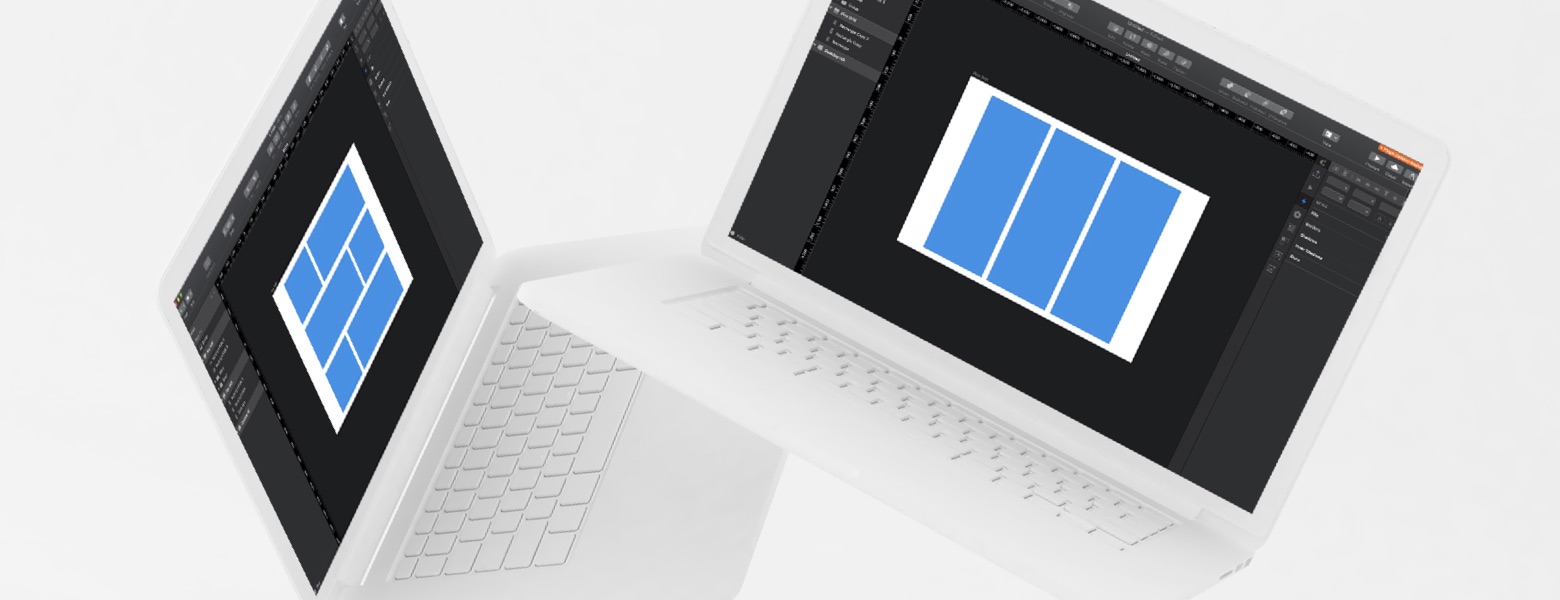
Grid layouts are most commonly used layouts in web design and we have been using Bootstrap or Foundation to make this layout a reality. Most of the time we use this to make grid layouts. When using Bootstrap we have only options to split the columns to maximum 12 or less. We have to add CSS to overwrite to meet our requirement. To do grid layouts faster we can use Flexbox or CSS Grid which provide more flexibility than Bootstrap. Which one fits you best?
Flexbox
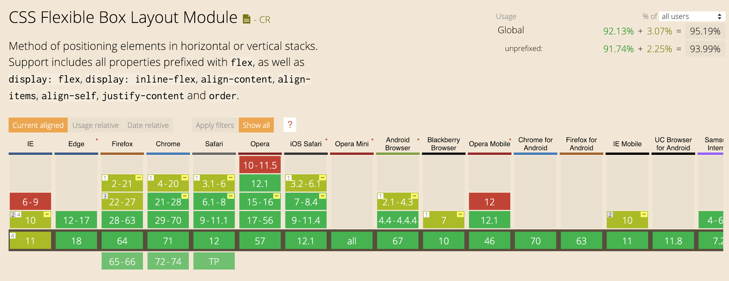
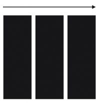
When we want to lineup elements in one direction or in one dimension we use Flexbox. One dimensional means arrangement of elements in either rows or column. It provides a better arrangement and space allocation of elements in a page. Flexbox has support in all modern browsers and partial support in Internet Explorer 11 & 10.
CSS Grid
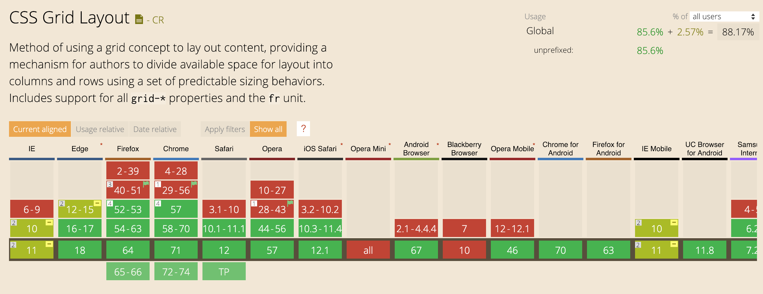
We use CSS grid when we want to have elements in two dimension that means we can manage elements in rows and columns. Numerous layouts are easier by using CSS grid than that of using tables. Even Though it is the most powerful layout tool, unfortunately, it is not supported in older browser & IE 11. Users should be aware of the partial support and use the CSS grid and for IE we need to make sure the layout looks good. Since Flexbox has more support than CSS grid in most of the older browsers we can use Flexbox as the fallback option.
Flexbox vs CSS Grid
Flexbox is made for one-dimensional layouts and CSS grid is made for two-dimensional layouts. Flexbox has content first approach & CSS grid has layout first approach. This means if you are pretty much aware of the content go with flexbox or else go with CSS grid.
In doubt to use Flexbox or CSS Grid?
If you really have time to try using both the techniques and evaluate which one is the most successful one or you have to foresee about for example like layout changes, more content coming in the future etc. Each of the technique excels in different ways and so we need to figure out which one to use for our layout.
Browser Support
The support for both has increased in the year of 2018 and I believe 2019 will be the year for both Flexbox & CSS Grid and will be a must-have skill for Front-end developers.
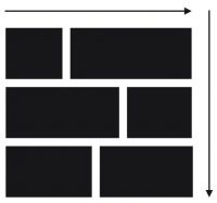
The images below shows detailed analysis for Flexbox & CSS grid.